The Long Short Road
The Long Short Road is a mental health non-profit organization, specializing in suicide prevention education and mental health awareness workshops. They are also involved with stigma reduction work, developing mental health support groups in religious Jewish Communities, and are building a therapy subsidy program for individuals who can’t afford therapy.
The Project
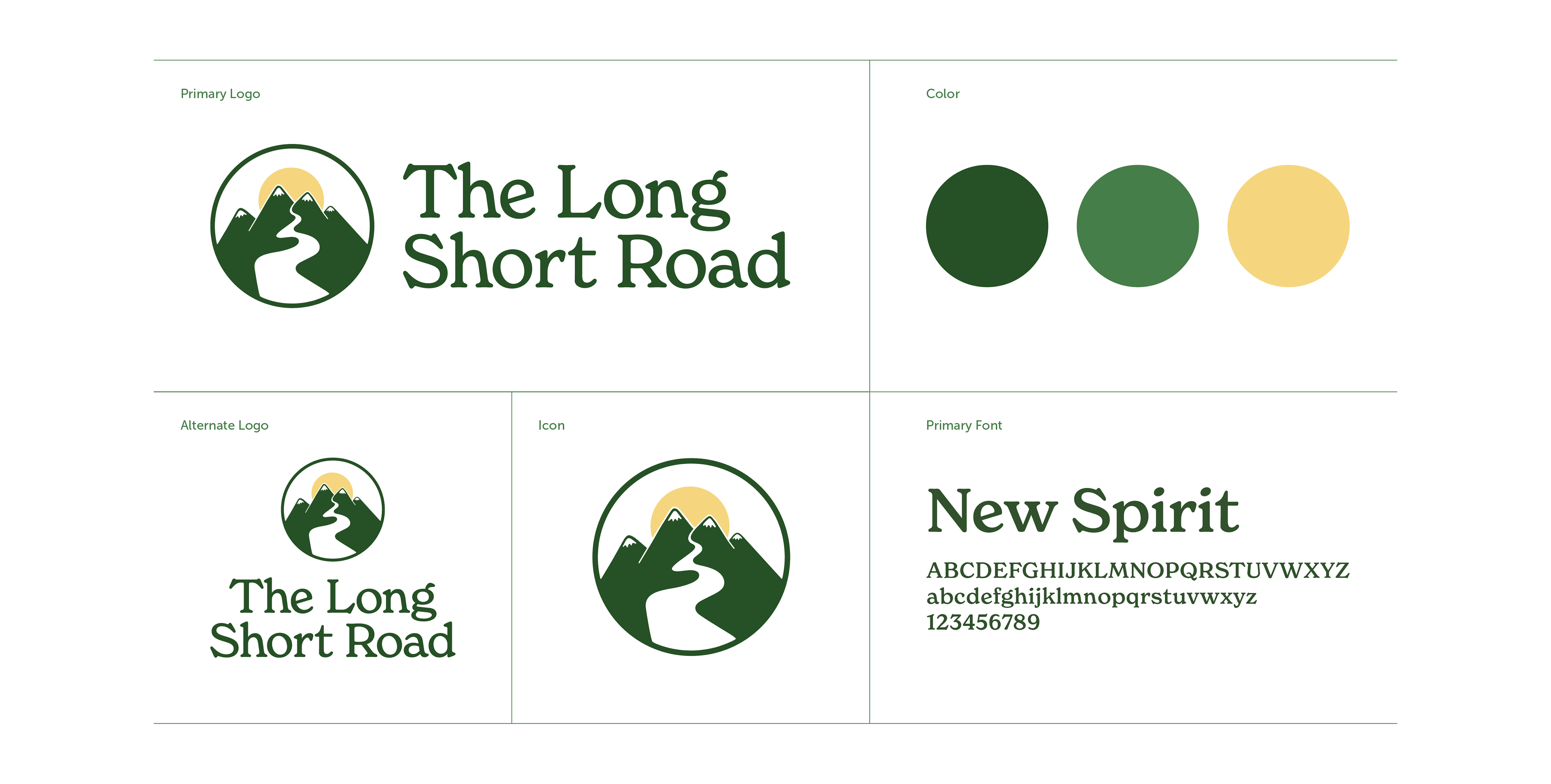
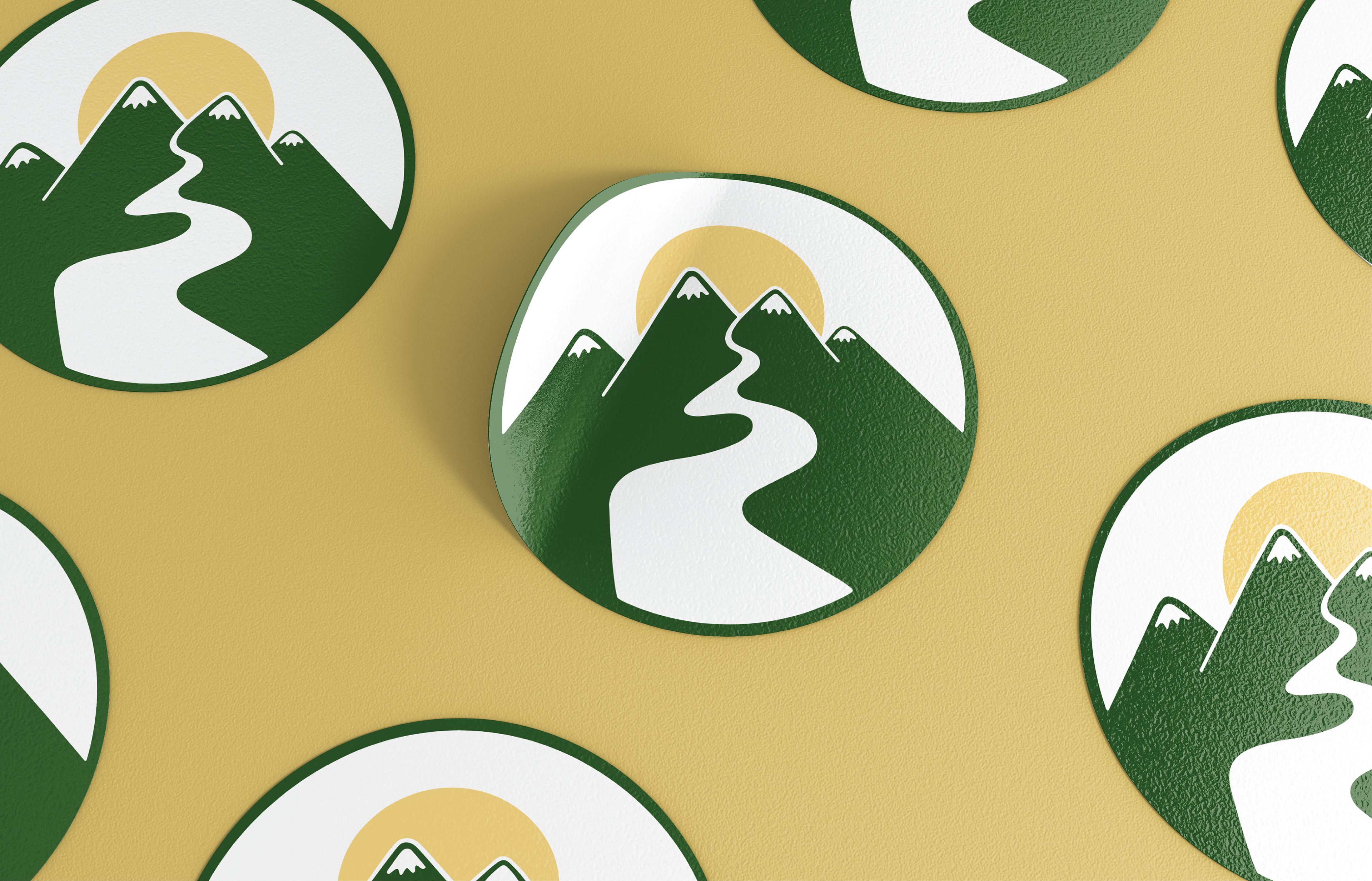
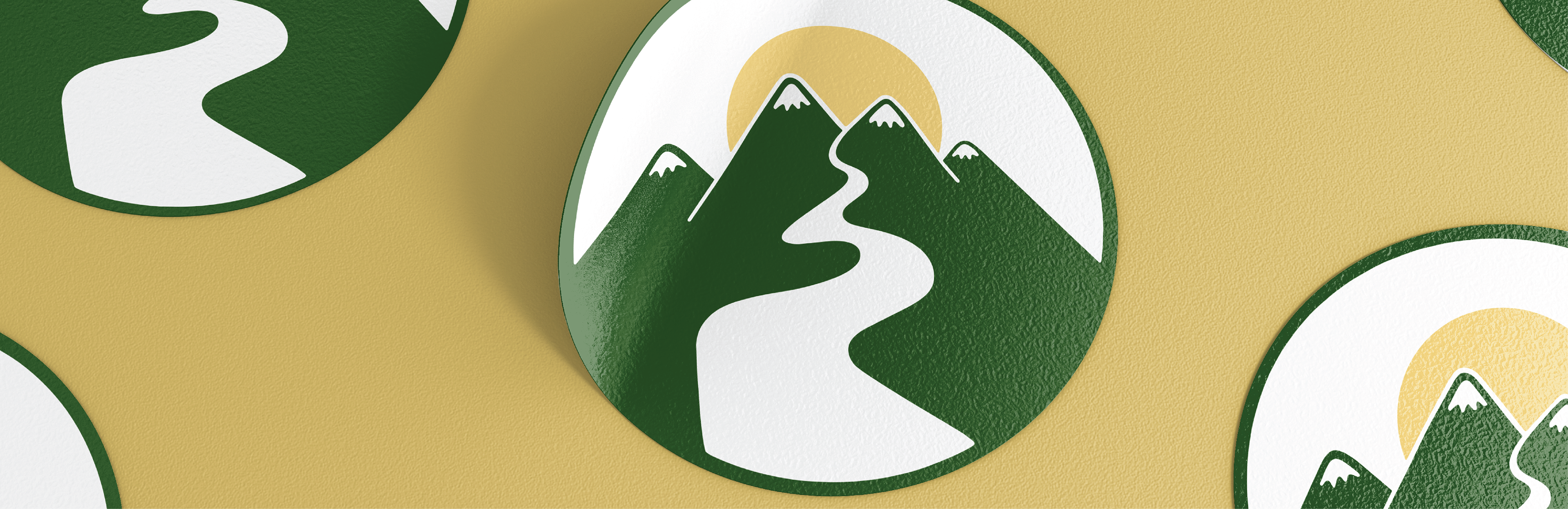
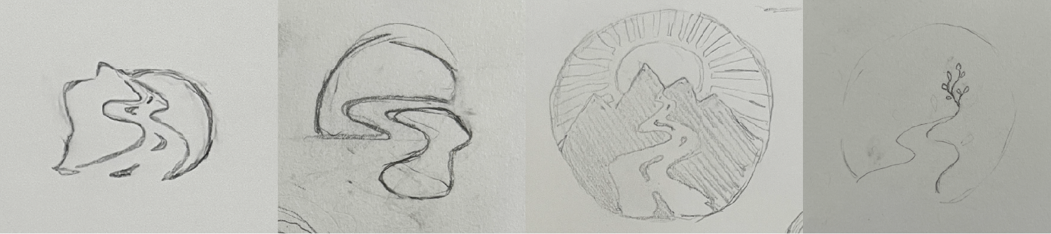
The original logo was designed through Canva, resulting in an impersonal feel. The goal of the logo redesign is to tell the story of the long short road; winding and challenging to cross, but worth it in the end. The logo should feel warm and friendly to reflect the hope at the end of the road rather than the possibly rough and temporarily unpleasant feel of the road itself.
Behind the Design
The name, The Long Short Road, comes from a parable in Chassidic philosophy that tells about a short long road and a long short road. A short long road is a road that appears easier and less complicated, but ends up being more difficult in the long run. The long short road is a road that appears challenging and treacherous, but ends up easier and more fulfilling. This is reflected in mental health recovery and healing because taking shortcuts (or the easy road) doesn't really work in the long run. Taking the time to work through problems seems scary at the beginning, but allows you to truly achieve your goals.
The original design had a distinct desert theme, but for the redesign I wanted to shift the focus from a specific location to the journey itself. The mountains give the road something to wind through, a nod to journeys that feel long and layered, and the sun peeking out from behind them is meant to capture that sense of something good waiting at the end. The typeface was a deliberate choice too. It has that storybook quality that felt right for the "new chapter" idea, and the rounded letterforms keep things feeling calm and approachable.
At the client's request, I worked from the palette they provided rather than starting fresh, to keep the transition feeling familiar. I introduced a soft yellow to support the sun imagery and to bring in a sense of hope and optimism, which felt central to the concept, and made some slight adjustments to the greens so they'd feel more cohesive.